AERE Network Brand Guidelines
This guide establishes the visual identity and usage guidelines for the AERE Network brand. Consistent application of these standards helps maintain brand recognition and professionalism across all platforms and communications.
Logo
Primary Logo
The AERE Network logo represents the core identity of the brand. It should be displayed at 200px width by 50px height for optimal visibility and recognition.
Minimal Logo (Light)

The minimal light version of the logo is used in simplified contexts where the full logo might be too detailed, while maintaining optimal visibility on darker backgrounds. This white version is designed specifically for dark backgrounds.
Gray Variant
The gray variant of the logo is used in documents or contexts where color printing isn't available, or when a more subtle branding approach is needed.
AERE Token Logo Variations
The AERE token logo is a distinctive symbol representing the network's cryptocurrency. It features a stylized triangle "A" design with circuit-like patterns that emphasize its technological foundation. These 3D rendered versions can be used across various digital platforms.
Token Logo - Stacked Coins

The stacked coins variation emphasizes the token's value proposition and can be used in financial contexts or when discussing AERE as a digital asset.
Token Logo - Front View

The front view of the AERE token provides the clearest view of the emblem and is ideal for primary token identification across platforms.
Token Logo - Perspective View
The perspective view adds dimensionality to the AERE token logo and is suitable for marketing materials that require a dynamic visual representation.
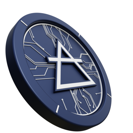
Token Logo - Angled View

The angled view showcases the circuit-pattern detail and the triangular "A" symbol that represents the core of the AERE identity, emphasizing the technological foundation of the network.
Color Palette
AERE Network's color palette combines vibrant blues with an energetic green accent, set against a clean neutral background palette. This color scheme evokes trust, innovation, and technological advancement.
Typography
AERE Network uses Inter as its primary font family. This modern, clean sans-serif font provides excellent readability across different screen sizes and media.
Usage Guidelines
Logo Usage
- Use the logo at its intended aspect ratio
- Maintain clear space around the logo
- Use the provided color variants appropriately
- Ensure the logo is clearly visible against the background
- Stretch or distort the logo
- Add effects like shadows or glows
- Rotate or flip the logo
- Change the colors of the logo
Color Usage
- Use the primary blue for main CTAs and key UI elements
- Use the green accent to highlight important information
- Maintain contrast ratios for accessibility
- Use the specified neutral colors for backgrounds and text
- Create new color combinations outside the palette
- Use colors that clash with the established palette
- Override color meanings (e.g., don't use blue for error states)
- Use low-contrast color combinations that reduce readability